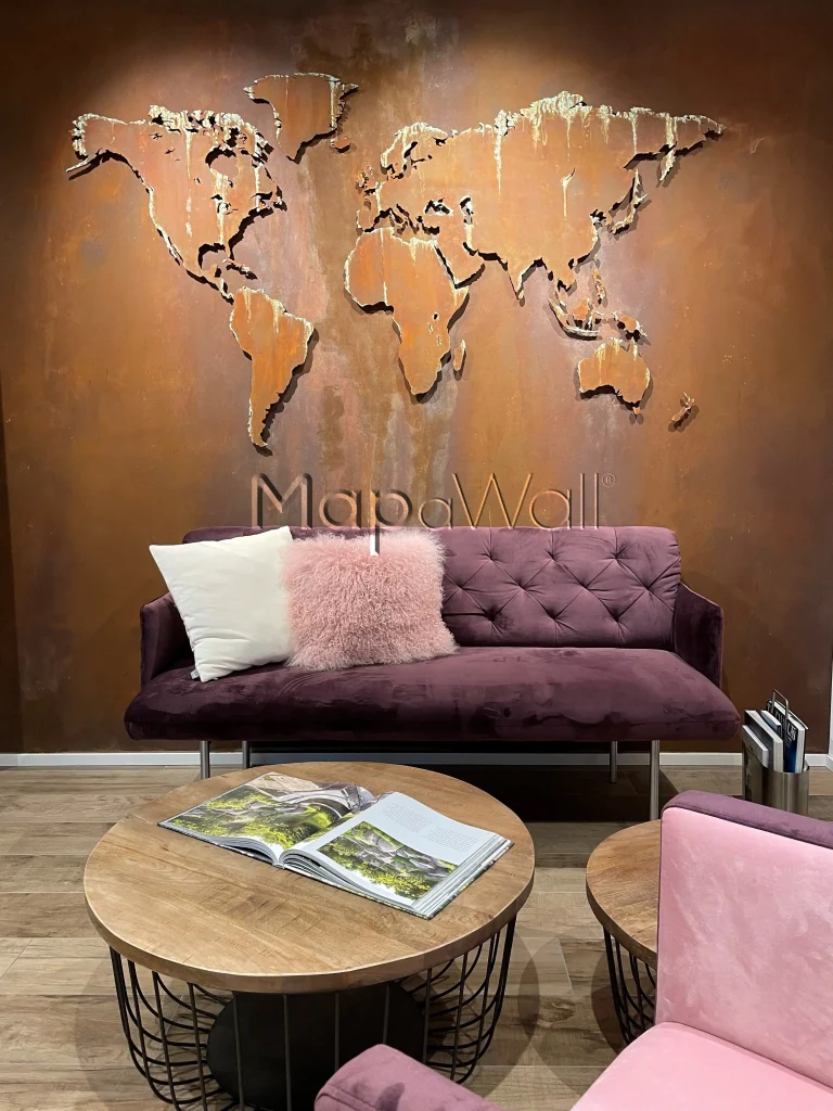
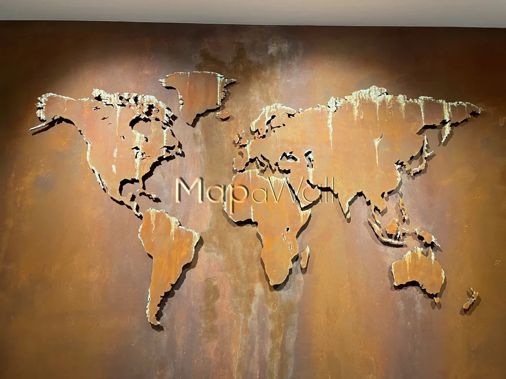
Sometimes our clients change our maps into a design of their own. Today's map was transformed in a real spectacular way. In a way that it would perfectly blend in the interior. After a decade of experience in crafting world maps you would have thought that we have seen it all. But on the contrary. Our clients, mostly interior designers, keep surprising us with new creative ideas.
The European Oak wood we use for crafting our world maps epitomises exceptional quality, classified as the A-class Oak available on the market. Featuring minimal knots in its grain, it gives a pristine appearance, making it particularly appealing for those keen on having country borders in their map. The uniform colour of this wood enhances border visibility compared to our other wood variants such as American Walnut or Rosewood Santos.
But the clients who ordered this Oak world map choose the Oak for another reason. First of all, the map was ordered without the country borders, because it had to represent the world in a more abstract way. Second, the map had to be offered without any type of treatment such as oil or varnish. Mainly because the client wanted to customise the map himself. And we must say, the result is stunning. In the featured photo you can see how the map seamlessly blends in the interior. The colours pink and purple are in one way daring, but by looking at the whole you understand that it's all about the colour schemes and not the individual colours.

In the featured interior, the designer opted for a blend of brown and purple hues, evoking a rustic aesthetic. Reflecting this theme, the map has similar tones, accentuated by subtle highlights resembling spilled acid. These unique accents are actually the natural colour variations in the Oak wood. It's a striking fusion of design and nature, adding a distinctive touch to this space.

Our loyal readers and social media followers are well aware of the boundless possibilities when incorporating diverse maps into various interior settings. In many instances, the most striking aesthetic outcomes are achieved by selecting a complementary wall colour. By infusing a wall with carefully chosen colours that harmonise with other elements in the space, it becomes remarkably simple to make a bold and captivating statement. Introducing a world map with a similarly distinctive appearance can elevate the entire ambiance, resulting in a space that leaves visitors utterly mesmerised.
I you have any questions regarding these type of custom builds, feel free to drop us a message.