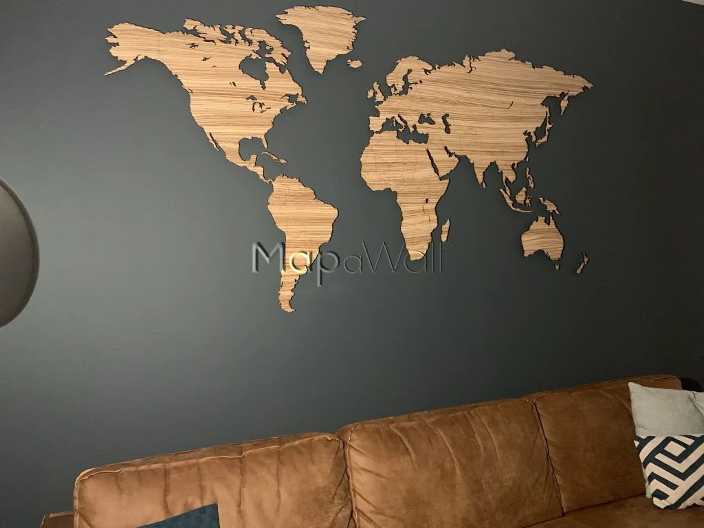
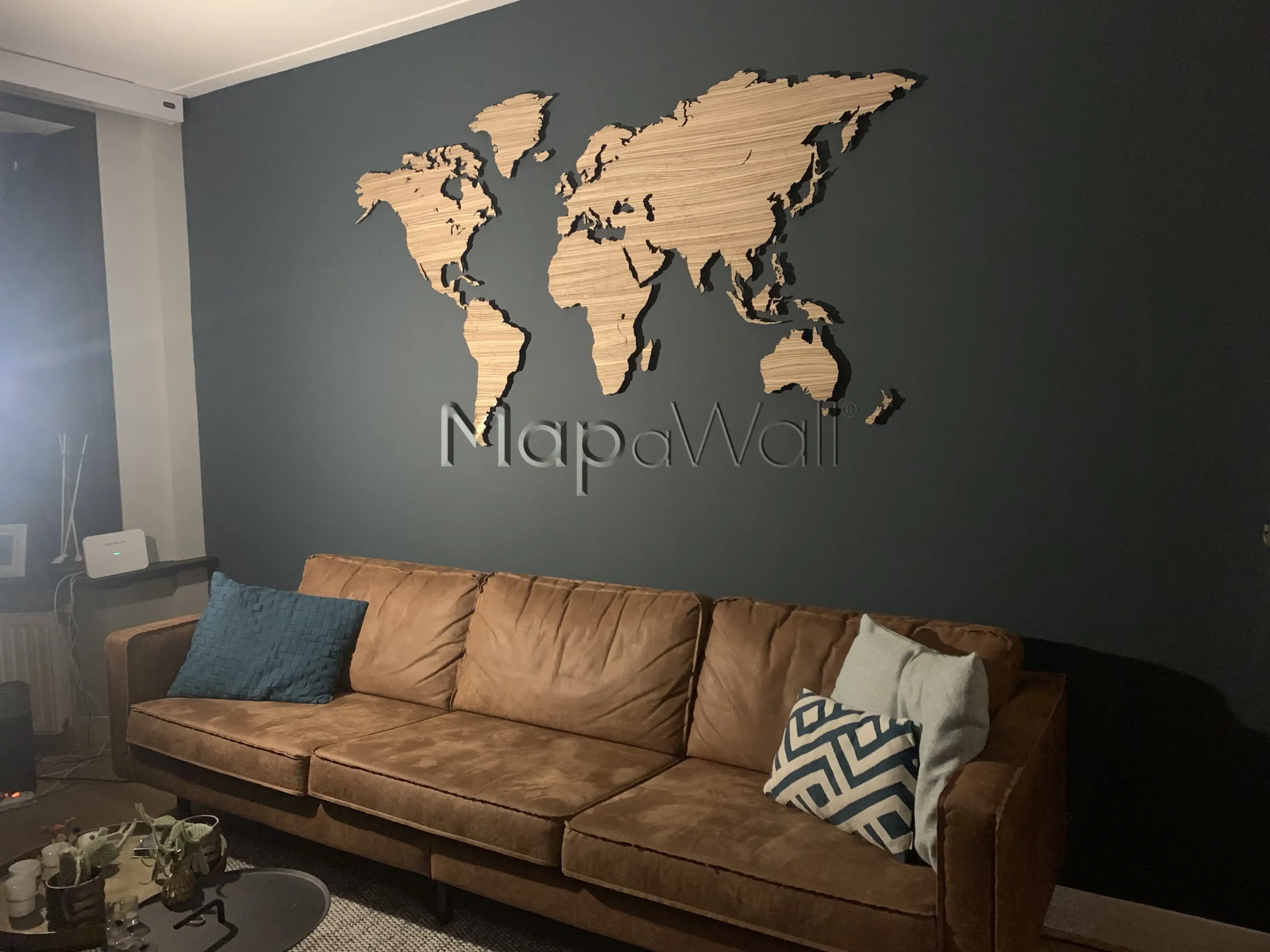
The appearance of a world map greatly depends on where it is installed and the choice of wood, as well as the type of wall it is mounted on. In today's example, we'll explore how to best show your wooden world map and enhance the contrast between the wall and the map itself.
The wood used for this map is named after the distinctive stripes resembling those of a zebra: Zebrano wood. Harvested in regions where export limitations are often imposed, Zebrano wood primarily originates from South- and Central America. Known for its water resistance and hardness, it's commonly used in boat interiors and musical instruments. However, its most notable features are its appearance and namesake. Characterised by contrasting dark and light stripes, Zebrano wood captivates attention when incorporated into furniture pieces. While not ubiquitous in every interior, its uniqueness makes it a treasure worth appreciating. Also have a look how the Zebrano map looks on a white wall.

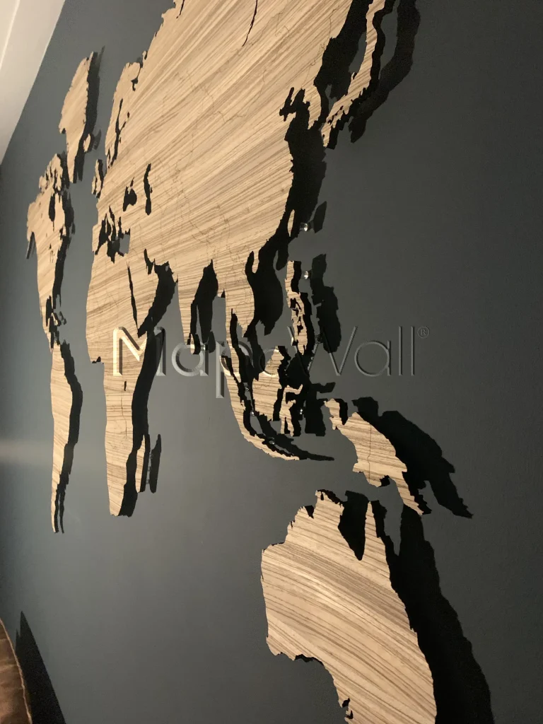
Opting for a light wooden world map suggests pairing it with a darker wall colour for optimal contrast and aesthetic appeal. Conversely, a dark map against a light wall can often feel overwhelming. However, moving away from the conventional choice of white for your wall colour can really surprise you, enhancing your interior's overall ambiance. Introducing a touch of colour can spice up your space more than it might seem. Today's example illustrates this point, where the client has opted for a striking black backdrop for their world map. The contrasting light stripes of the Zebrano wood infuse playfulness and draw attention to the map itself. Additionally, strategic lighting from the sides creates captivating shadows on the black wall, further accentuating the map's presence. We would say this installation and combo is one well done!

